Garden Companion
The Garden Companion app is a mobile app concept that helps visitors plan, navigate and explore the 1,100 acre property. It highlights dining, events and seasonal activities that lead to longer visits, more spending on-site, and ensures they leave not wishing they had missed anything.
Role
Tools
Designer
Figma/Figjam
The Problem
Longwood Gardens is one of the most visited horticultural destinations in the US, with no app to support the visitor experience or help guests plan their time spent there.
With no way to build an itinerary or discover what's blooming or happening on a given day, visitors routinely miss out on things they wish they had seen.
Longwood loses ticket sales, dining reservations, and paid event revenue every time visitors leave not knowing what’s available
The Solution
Garden Companion is a mobile app that helps visitors plan their time, discover blooms and events and navigate the grounds, giving Longwood a direct channel to drive ticket sales, dining reservations, and repeat visits.
RESEARCH
Reading the Reviews
With over 1,000 acres, 25+ indoor/outdoor garden areas, thousands of species of plants and rotating seasonal exhibits, it’s clear that the Gardens can be overwhelming and planning accordingly is necessary.
Survey
I posted a survey to a Facebook group for locals to understand what kind of things they would find useful in an app for the Gardens. This reinforced my assumption that visitors want a better tool to navigate the space.
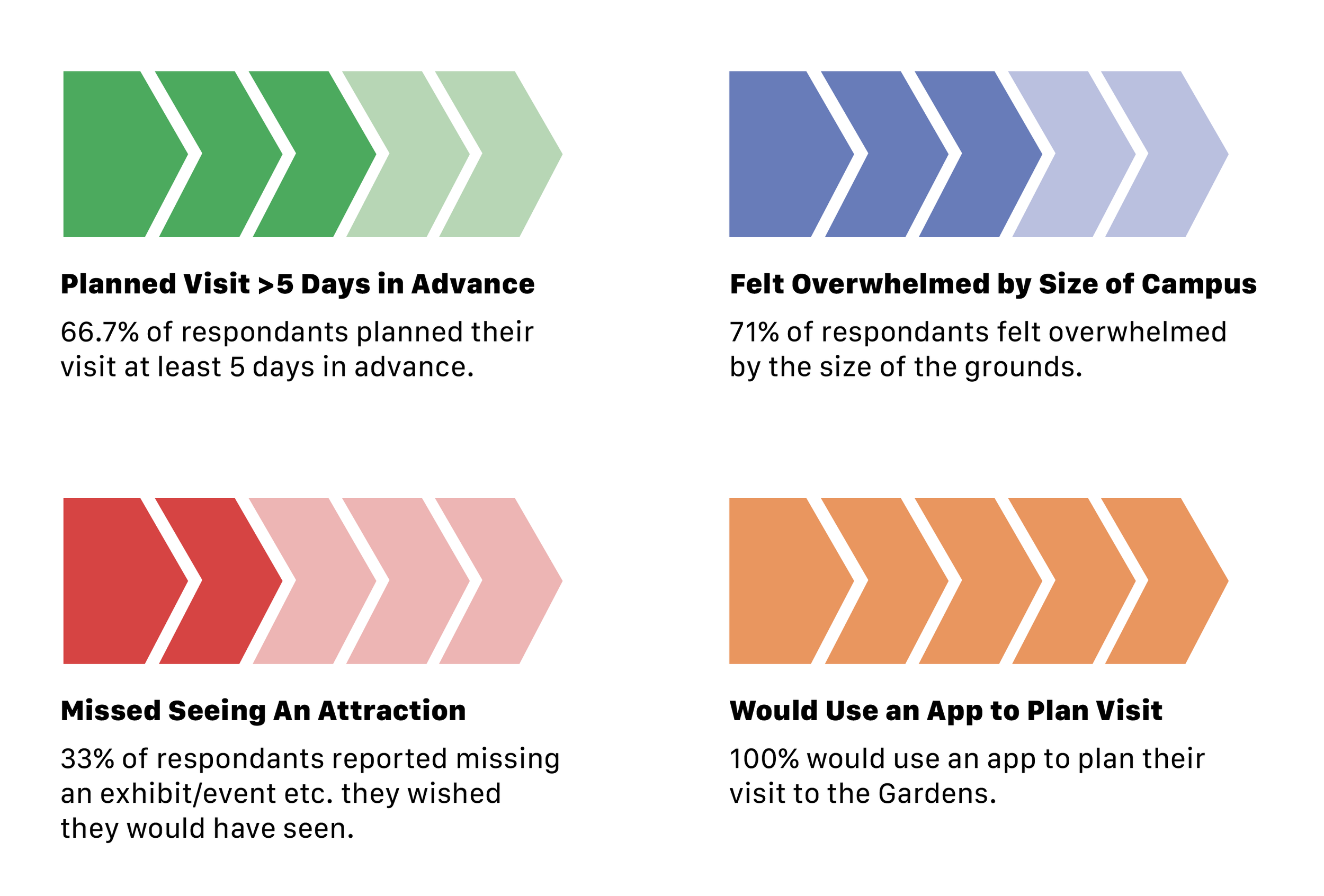
I wanted to get out all of my thoughts/questions to prioritize what should be included in the app. There were similarities in some of the thoughts/questions, so I organized them into categories. This process helped me realize that while I intended for the app to be used for planning in advance, that might not always be the case. Visitors might show up with nothing planned and use the app to guide their trip the day-of.
Brainstorming
Comparative Analysis
I looked at three apps that solve similar problems that I’m trying to solve: vast grounds with a huge amount of attractions/events, planning a personalized trip and making an itinerary, and overall discovery of things to do while there.
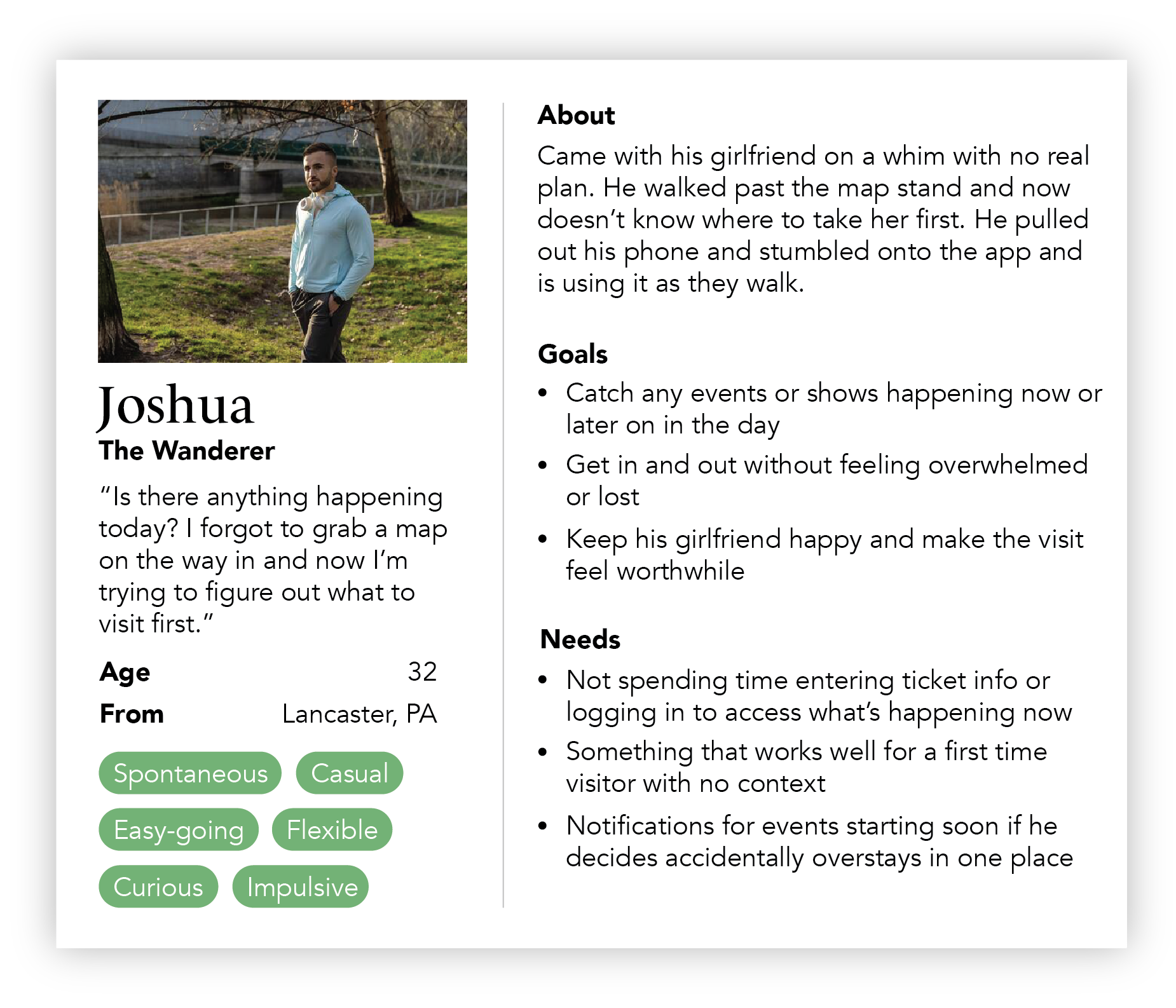
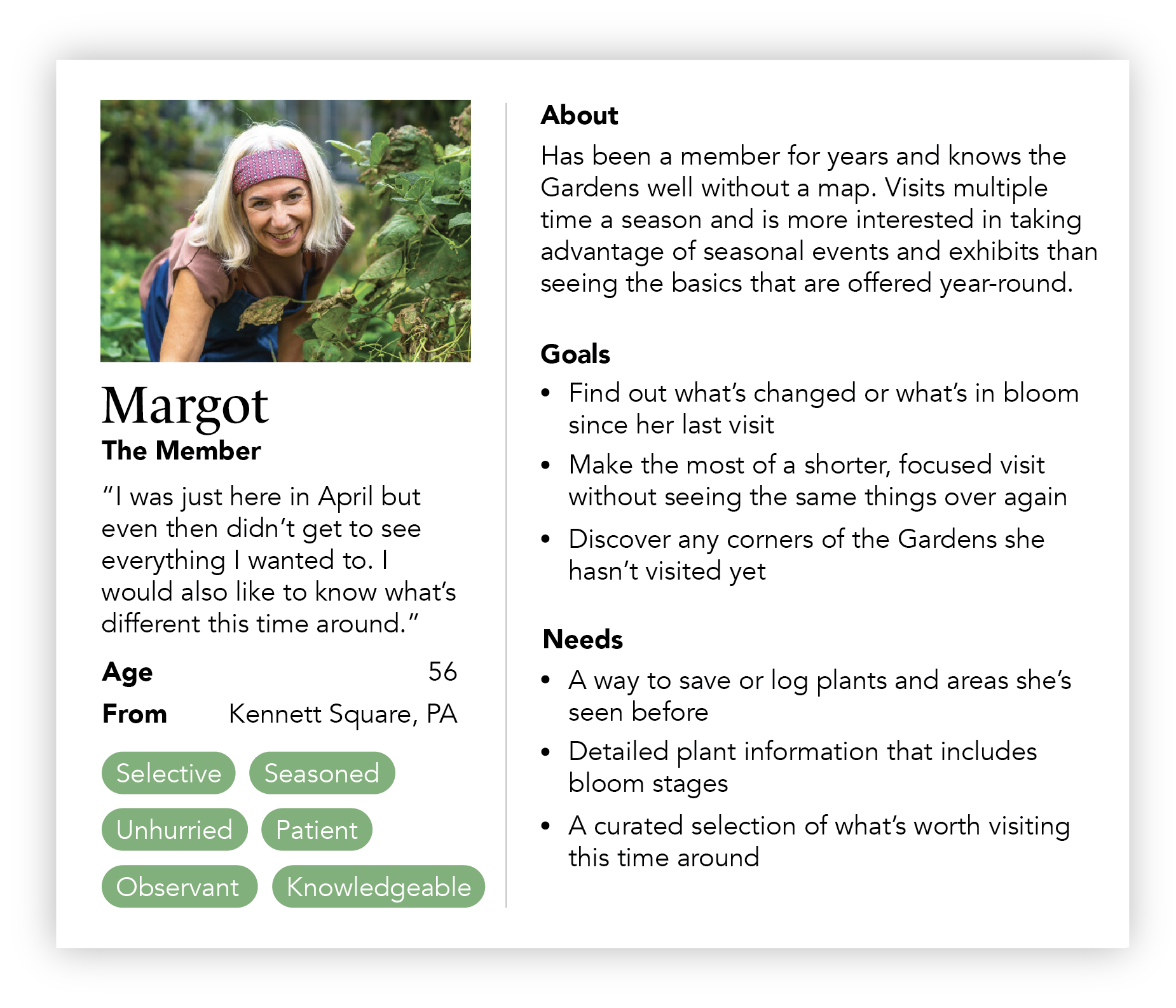
Audience
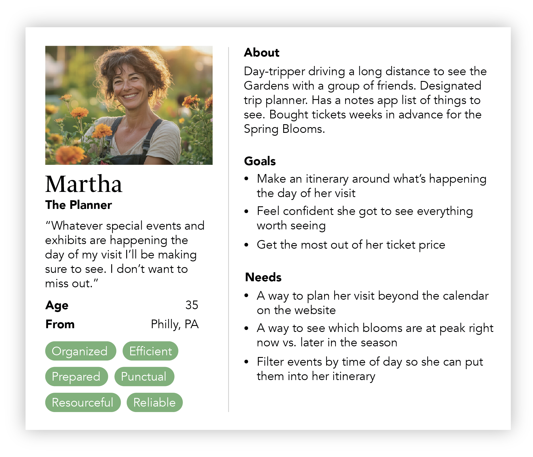
There were 3 main categories that the potential users of the app would fall into: those that plan ahead, those that show up to the gardens on a whim and need guidance day-of, and members looking to get the most of their memberships.
Evaluative Research
Before I started designing, I wanted to understand and categorize the massive amounts of events/exhibits to understand where they would live on the app. This helped for the foundation of the “Discover” tab.
For a better view, click here.
User Flows
My research helped me narrow down what the main features of the app would be, which I created into flows to map out the architecture of the app.
Wireframes
With a clear idea of what features/content should be included in the app, I started laying the bricks of the overall structure with my wireframes. I used the user flows to guide me and played with layout and content hierarchy before moving into high-fidelity. I ended up creating a repeatable system of cards that could be used on multiple pages for things like plant and restaurant info.
DESIGNS
Discover/Homepage
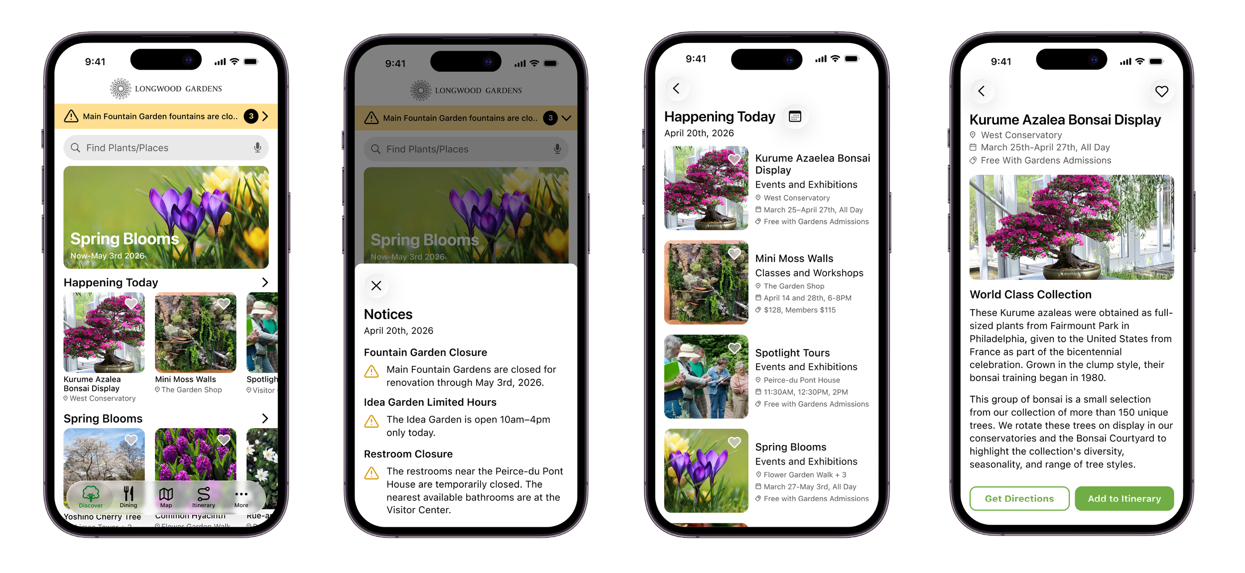
The Discover/Homepage is where the bulk of the content lives in the app for visitors to add to their itinerary. From here they can find what’s happening today, find what’s currently in bloom, dining and an option to explore by attractions (Fountain Shows, Members Only Events, Classes and more.
Dining
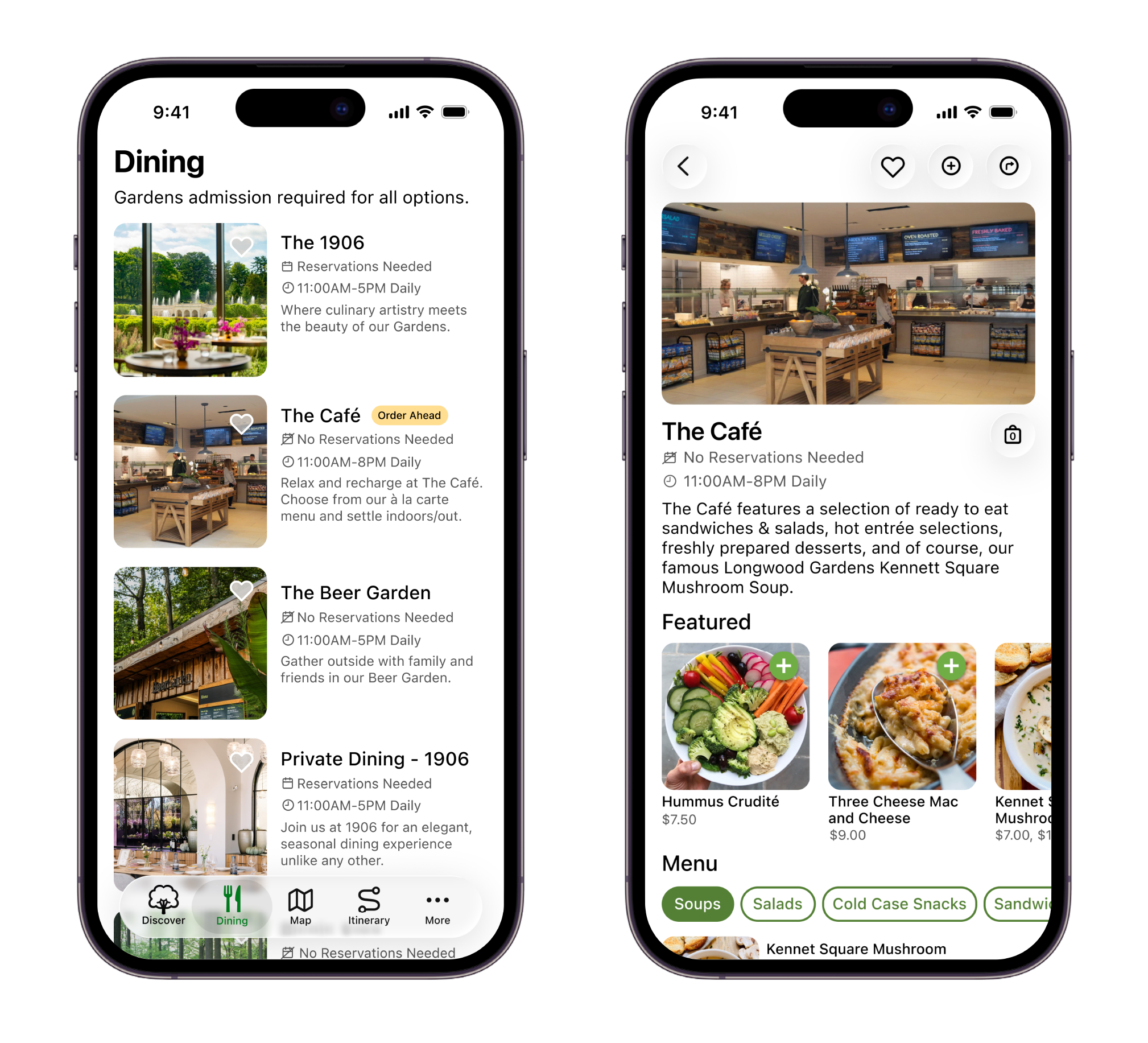
The Dining tab was added give an overview of what’s available to eat while/before visiting. Instead of having to look for options on the map or homepage, there is a dedicated page for it. It also makes ordering ahead possible to attract those looking to avoid waiting in long lines during peak times and or grab something quick to take along with them as they walk the grounds.
Map
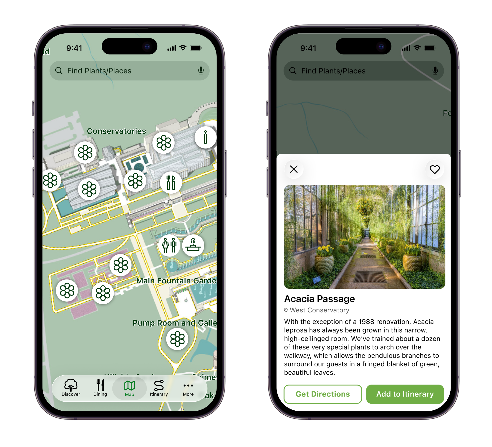
The map is a non-negotiable for a mobile experience, not only helping visitors locate restrooms and events/experiences they might have overlooked otherwise, but also giving a short overview of the attractions to help decide what’s worth seeing or not. Of course, all attractions can be added to the itinerary from the map as well.
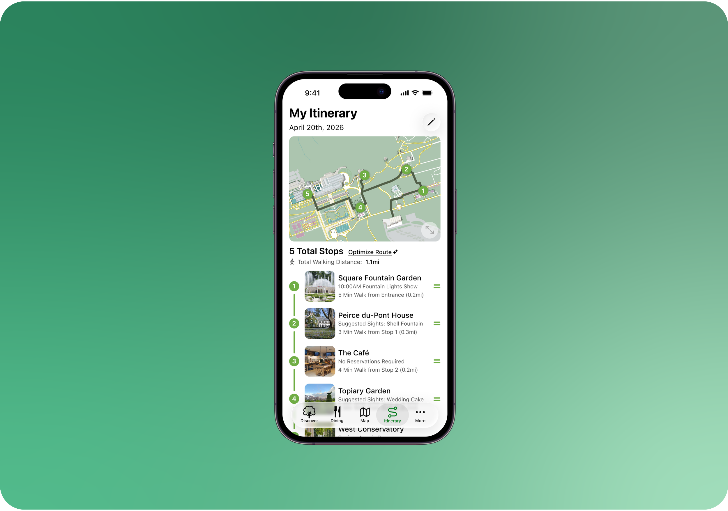
Itinerary
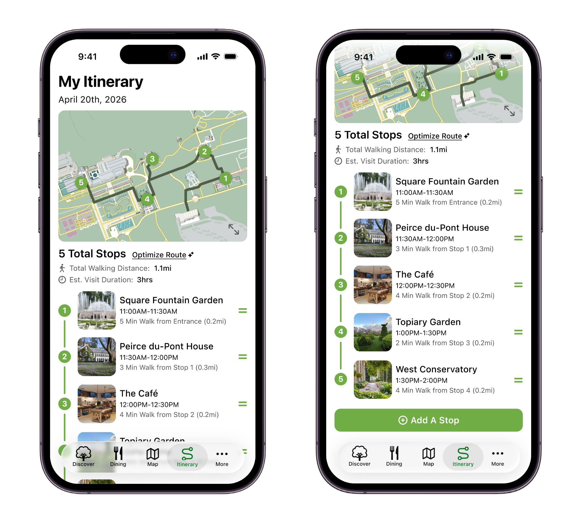
Whether you're mapping out your trip in advance or adding stops as you explore, the Itinerary tab was designed to take the guesswork out of navigating Longwood. Stops appear in the order you add them, the Optimize Route button uses AI to resequence your path and avoid backtracking, and drag-and-drop lets you adjust on the fly when plans change.
More
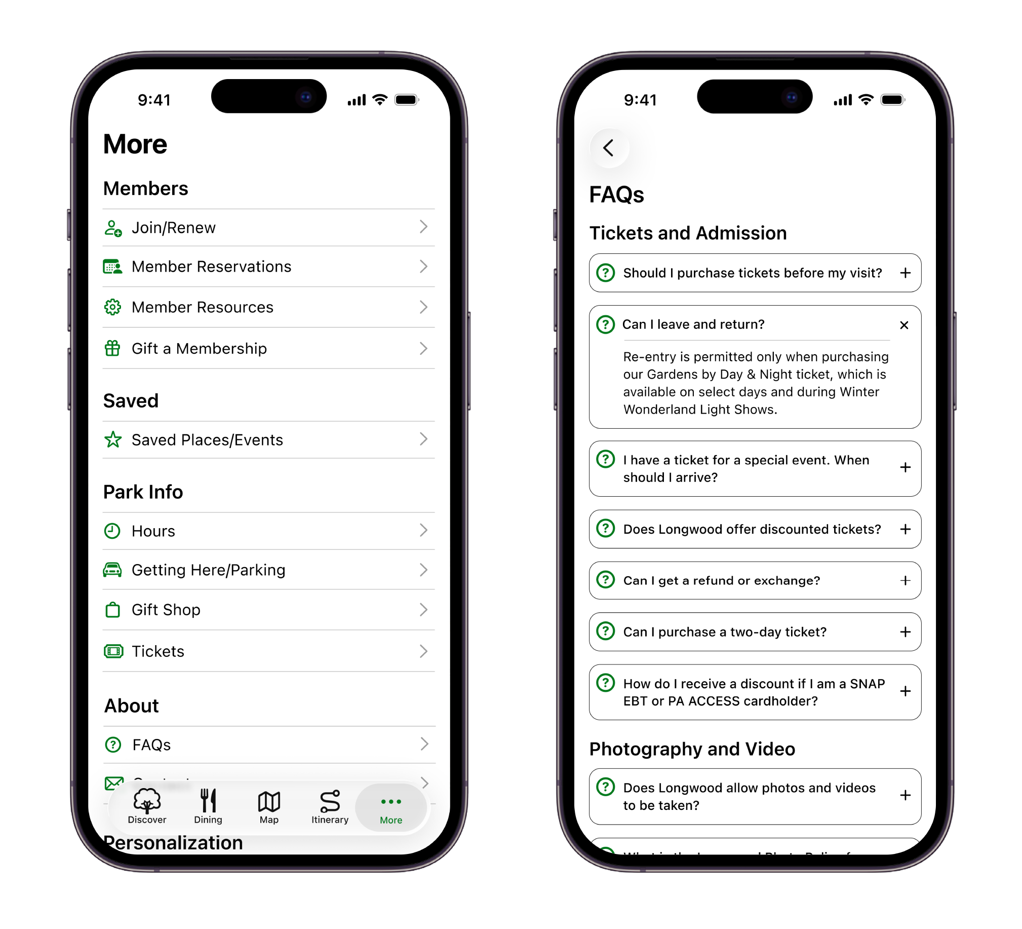
The More tab serves as a reference for everything the other tabs don't cover and everything a visitor might need during their trip. Information like hours, parking, tickets, FAQs, and membership tools all have a home here.
FINAL TOUCHES
User Testing
I conducted usability tests over Zoom and in-person with Gardens members and people who had visited before.
I tasked them with exploring the app and building an itinerary with attractions of their choice.

Observations
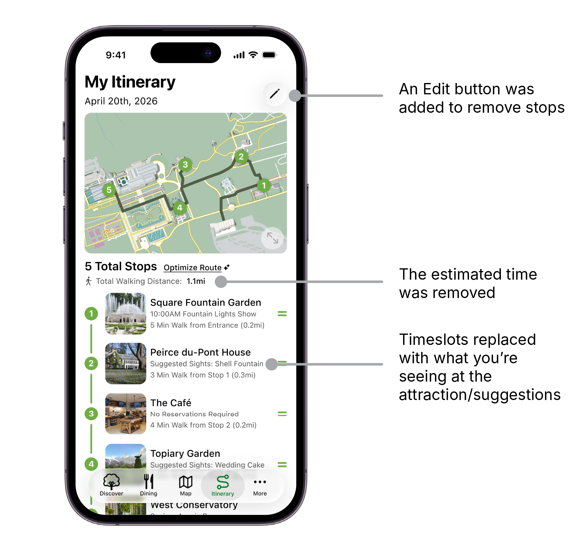
Most of the interest and feedback centered around the itinerary. Testing proved that users valued the idea of an itinerary to navigate the gardens and plan their trips to see everything they wanted to. There was confusion about how much time was allowed at each stop, and about how stops are added. For instance, if you add a flower to your itinerary, does the itinerary take you to the flower’s exact location, or the attraction its located within?
The Updated Itinerary
I updated the itinerary to make it possible to delete stops, and got rid of the estimated visit duration. I also replaced the time slots with what you chose to see within that attraction. If a specific attraction within that location isn’t chosen, it will suggest things to see there.
LESSONS & NEXT STEPS
What I Learned
You may have one idea on how to solve a problem, which leads to 2 or 3 smaller problems within that problem. This taught me the importance of understanding the user from the beginning, and not relying on guess work.
Design is never linear. The deeper you understand a problem and its users, the more you realize that the way you intended your product to be used won't always match how people actually use it.
If I Had More Time…
If I had a couple more weeks to work on this project, I’d dive deeper into some edge cases that came up along the way. What would a blank itinerary look like before anything was added? What would happen if a user tried to add events with conflicting time slots?
TRY THE PROTOTYPE!