
Picnic is a grocery delivery app designed to solve the problems that similar apps leave for users: poor replacements, bad communication, and generally untrained shoppers. Picnic solves this problem by matching you with a personal shopper of YOUR choice.
PICNIC
Role
Designer
Tools
Illustrator, Photoshop, After Effects, Figma
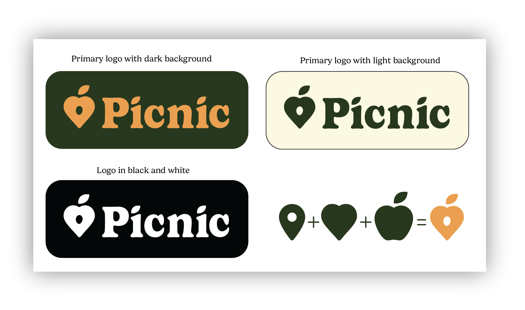
The logo combines a location pin, heart and apple into one icon to signify the brand’s core value, which is finding food you love nearby. The logo was designed to work in black and white and across all backgrounds, dark or light.
Logo Variations
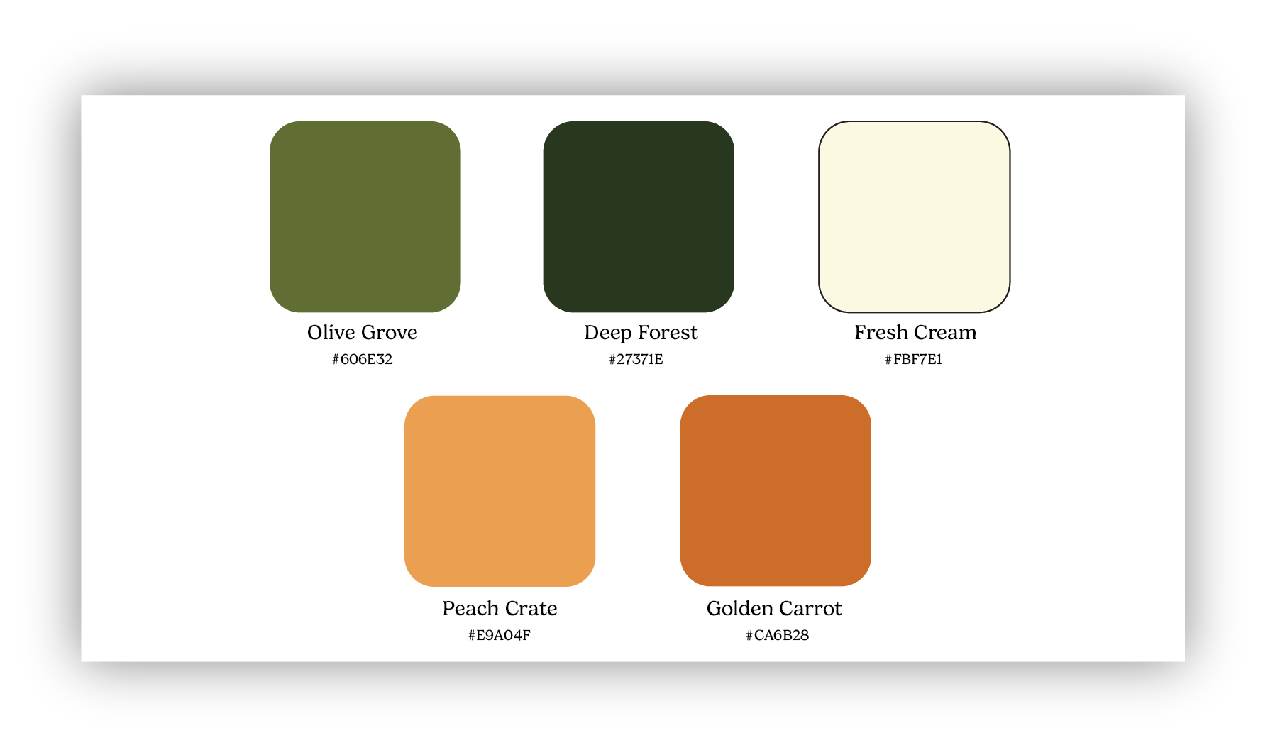
The color palette draws from what you’d see at the farmers market with earthy greens. The palette is designed to feel warm and appetizing.
Color pallete
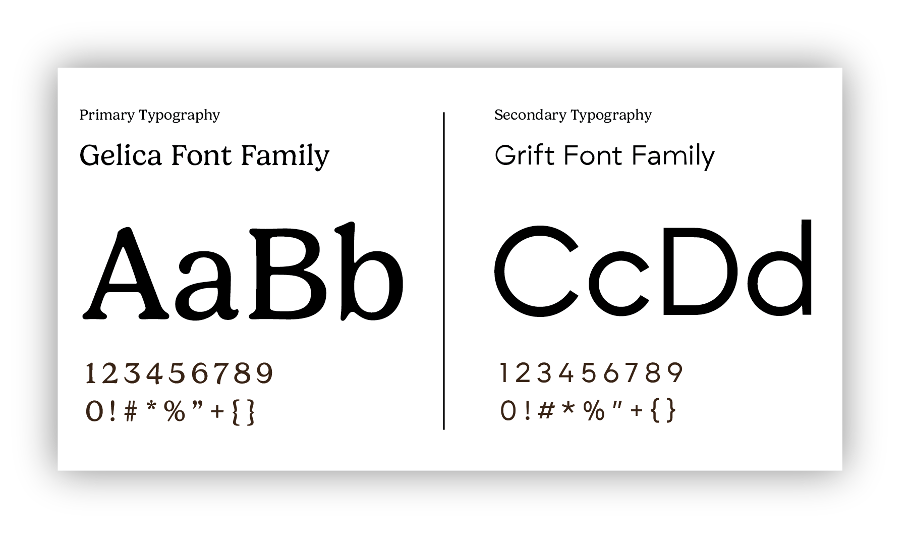
Picnic uses Gelica as its primary typeface and Grift as its secondary. Both are classy and retro, meant to feel inviting and trustworthy.
Typography
Ad campaign
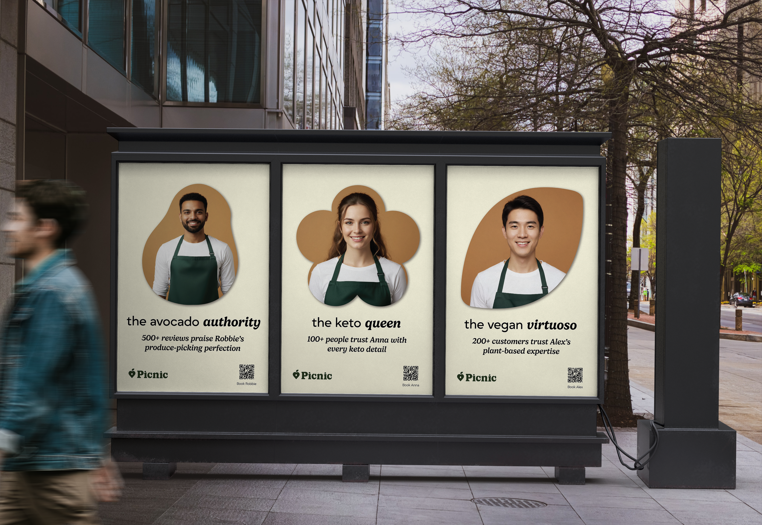
The ad campaign features OOH posters placed in cities or towns that highlight their individual expertise, from picking fresh produce to following dietary restrictions.
APP Screens
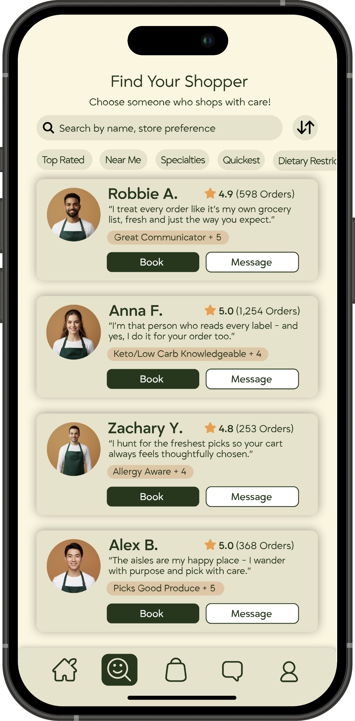
A key part of the shopping experience starts with selecting your personal shopper. Their personal accomplishments are highlighted on every card, making it easy to decide who you want to shop for you. You can also sort and filter the list to only show shoppers with certain expertise, like shoppers who specialize in being keto and allergy aware.
Find Your Shopper/Sort and Filter

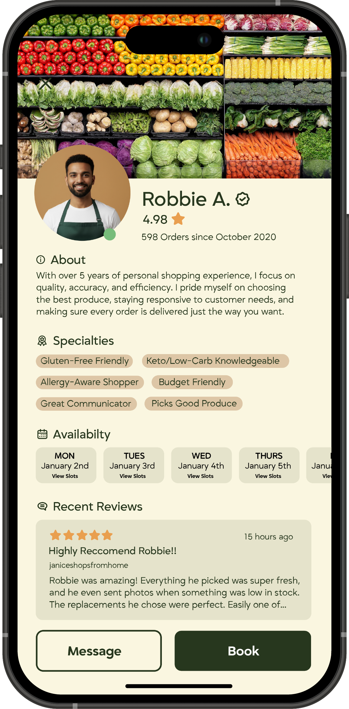
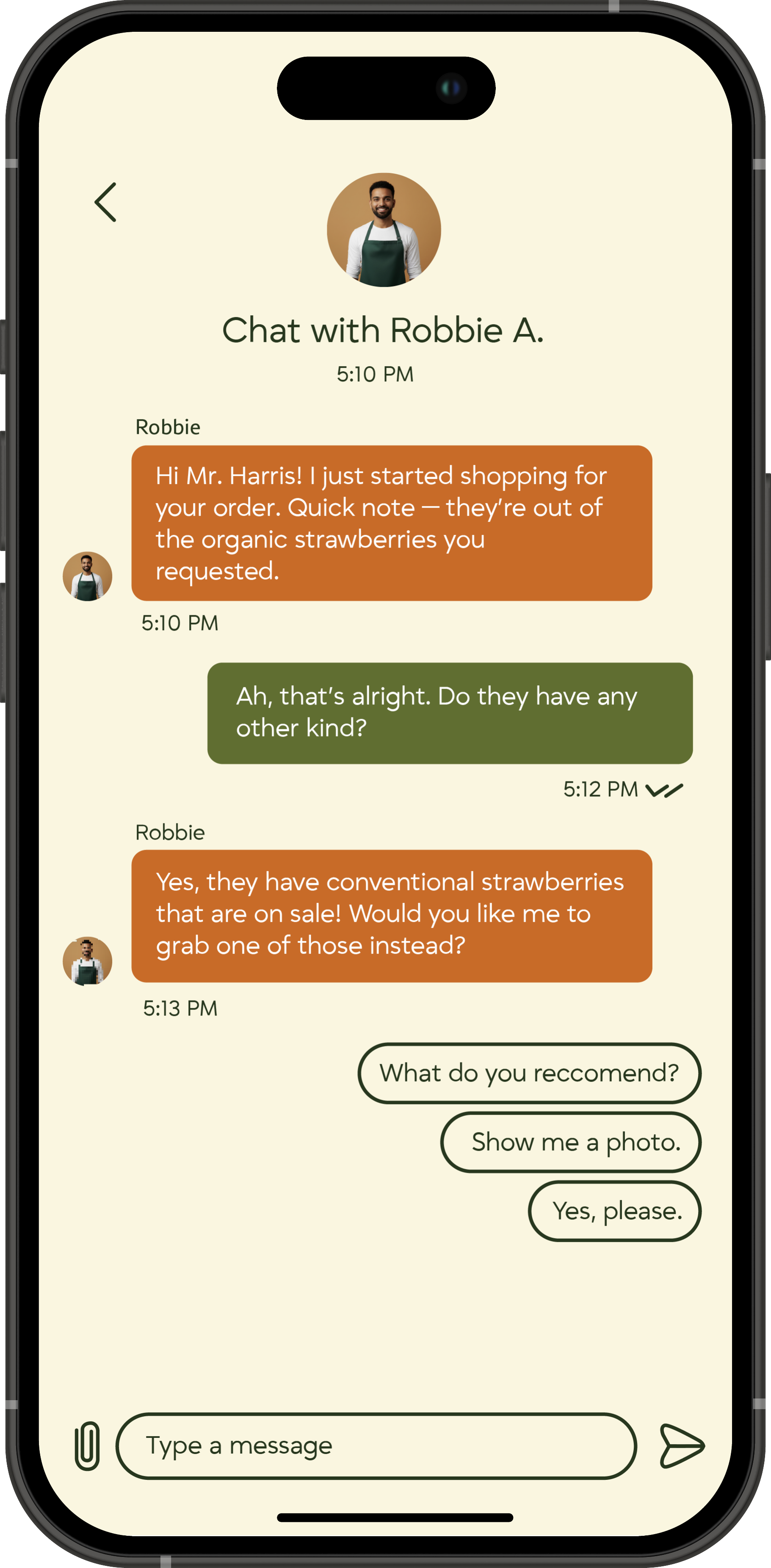
The shopper profile highlights all levels of the shopper’s expertise - from number of orders completed to their specialties and customer reviews. The chat feature is another way to personalize the experience, with shoppers being able to communicate substitutions, out of stock items and more.
Shopper Profile/Chat
Once a shopper is selected and the customer begins making their list, they will have the ability to select their preferred ripeness for produce like avocados and bananas.
Item Selection

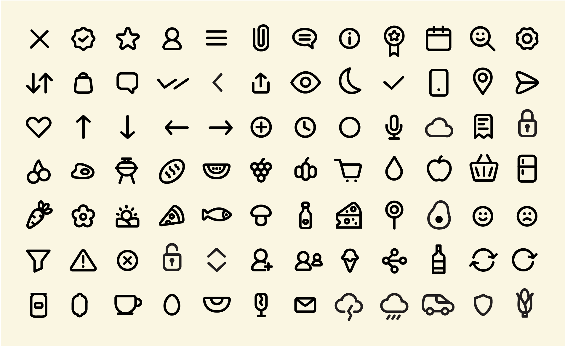
Icon set
never give up
never give up
Designed by Oliver, 2026